


Forest plot
Graphical visualization
A forest plot, also known as a blobbogram, is a graphical display of estimated results from a number of scientific studies addressing the same question, along with the overall results. It was developed for use in medical research as a means of graphically representing a meta-analysis of the results of randomized controlled trials.
Nº Q1437217 ★
Common · Literature
Forest plot
Graphical visualization
A forest plot, also known as a blobbogram, is a graphical display of estimated results from a number of scientific studies addressing the same question, along with the overall results. It was developed for use in medical research as a means of graphically representing a meta-analysis of the results of randomized controlled trials.
From Wikipedia
A forest plot, also known as a blobbogram, is a graphical display of estimated results from a number of scientific studies addressing the same question, along with the overall results. It was developed for use in medical research as a means of graphically representing a meta-analysis of the results of randomized controlled trials. In the last twenty years, similar meta-analytical techniques have been applied in observational studies (e.g. environmental epidemiology) and forest plots are often used in presenting the results of such studies also. Although forest plots can take several forms, they are commonly presented with two columns. The left-hand column lists the names of the studies (frequently randomized controlled trials or epidemiological studies), commonly in chronological order from the top downwards. The right-hand column is a plot of the measure of effect (e.g. an odds ratio) for each of these studies (often represented by a square) incorporating confidence intervals represented by horizontal lines. The graph may be plotted on a natural logarithmic scale when using odds ratios or other ratio-based effect measures, so that the confidence intervals are symmetrical about the means from each study and to ensure undue emphasis is not given to odds ratios greater than 1 when compared to those less than 1. The area of each square is proportional to the study's weight in the meta-analysis. The overall meta-analysed measure of effect is often represented on the plot as a dashed vertical line. This meta-analysed measure of effect is commonly plotted as a diamond, the lateral points of which indicate confidence intervals for this estimate. A vertical line representing no effect is also plotted. If the confidence intervals for individual studies overlap with this line, it demonstrates that at the given level of confidence their effect sizes do not differ from no effect for the...
Text: Wikipédia, CC BY-SA 4.0. · Image: James Grellier (CC BY-SA 3.0) ·
Related cards
-

Stem-and-leaf display
Plot where the ones digit is separated from the other digits, showing the distribution of the ones digit
Nº Q737802 ★
Not listed
-

Box plot
Method for graphically depicting groups of numerical data through their quartiles
Nº Q895726 ★★★
Not listed
-

Random forest
Statistical algorithm that is used to cluster points of data in functional groups
Nº Q245748 ★★★
Not listed
-

Choropleth map
Thematic map in which areas are shaded or patterned in proportion to the measurement of some statistical variable, using geographic boundaries
Nº Q261468 ★★★
Not listed
-

Genogram
Detailed family trees used in medicine and social work with a pictorial display of a person's family relationships and medical history that visualizes hereditary patterns and psychological factors that punctuate relationships
Nº Q1502486 ★★★
Not listed
-
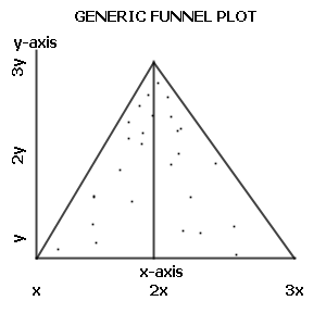
Funnel plot
Funnel plot
Nº Q967190 ★
Not listed